OnInbox - UX / Brand & Visual Design
Project Overview
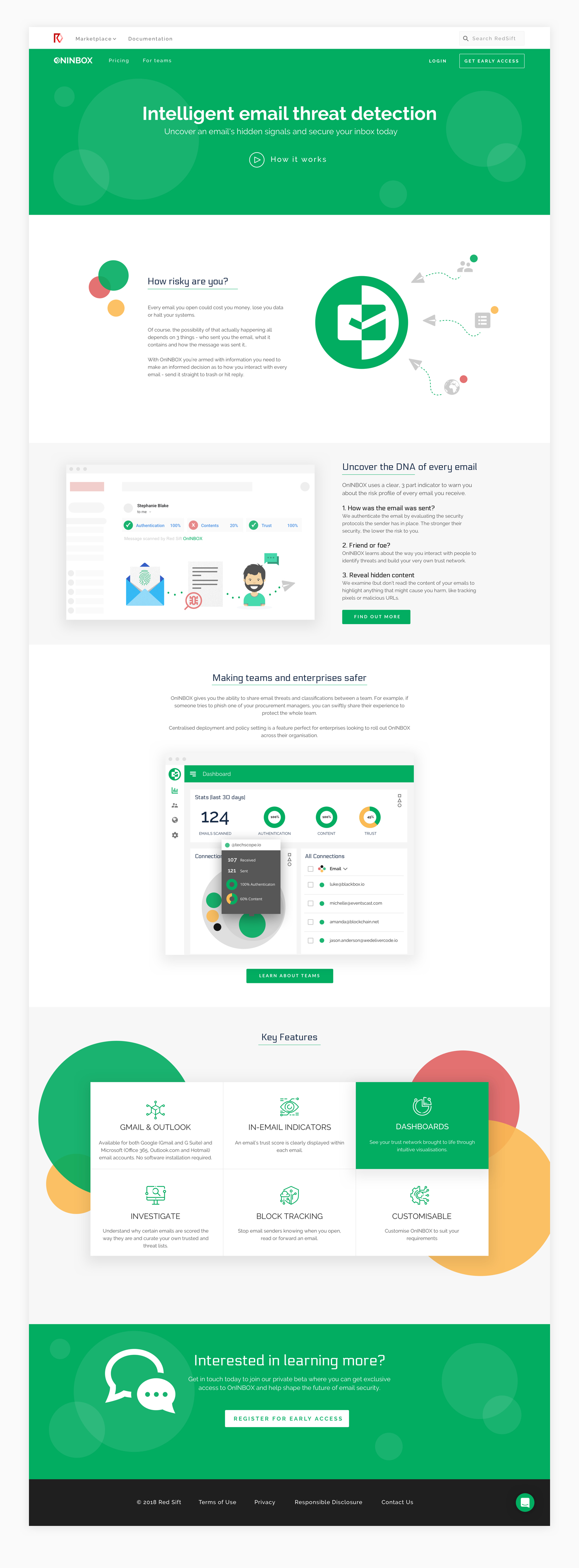
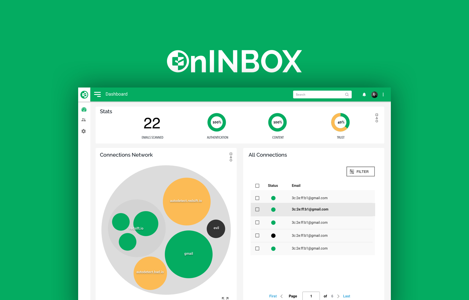
Red Sift are a leading cyber security startup who are building an open cloud platform that makes cybersecurity accessible to everyone. LInked with their already successful cloud platform that protects your domain, OnINBOX was envisioned to provide its users with intelligent email threat detection. Not only threat detection and prevention but also the ability to build up a trust network with tracking and data visualisation. The goal is to uncover the DNA of every email, how it was sent, was it a friend or foe and revealing any hidden and potentially harmful content.
My role: UX / UI design, Visual design, Brand
Challenge
How can we allow users to detect email threats and build a trust network to protect their business?
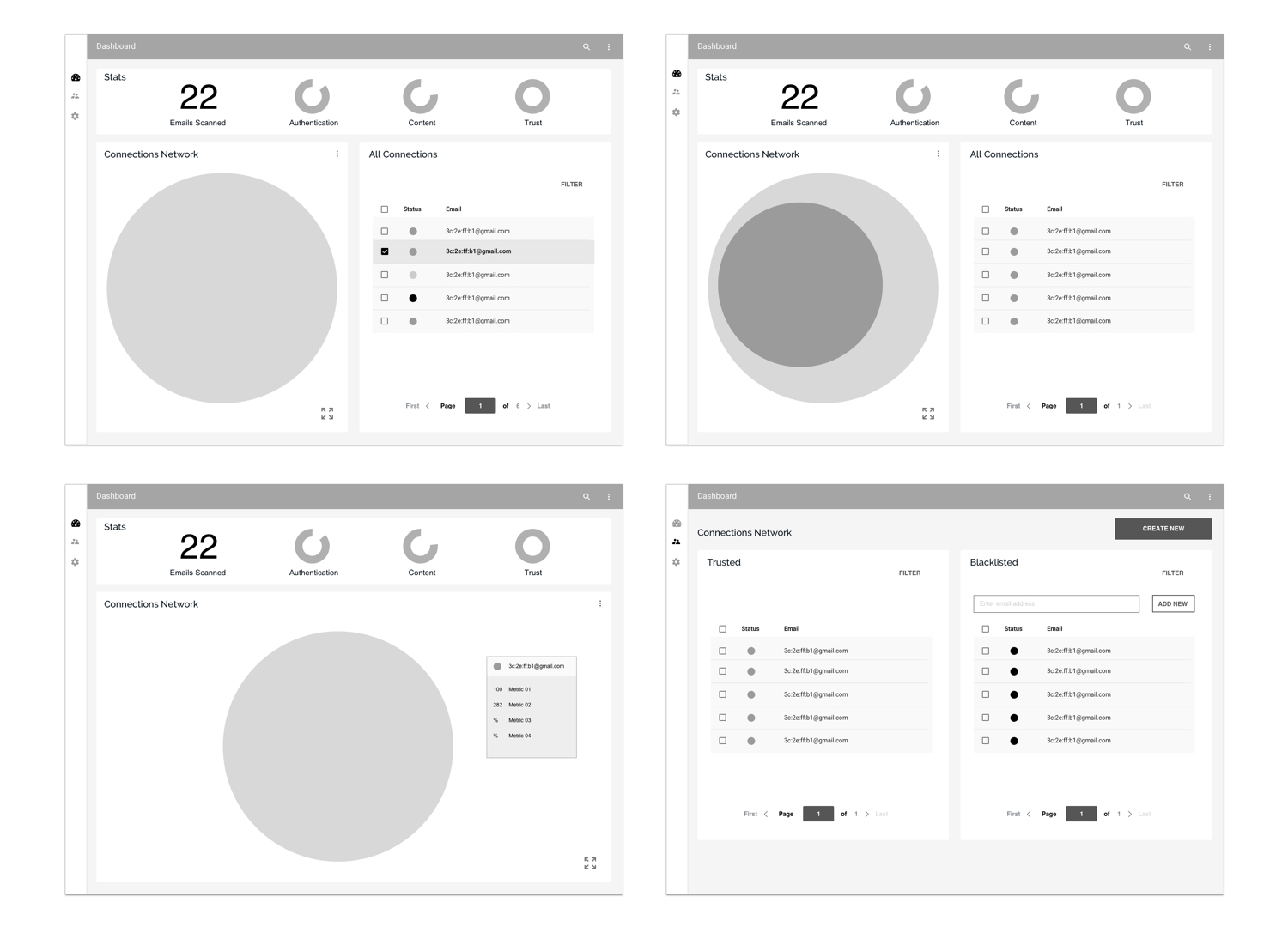
Working within their chosen framework based on Material design patterns I also needed to be mindful of the data visualisation algorithm that was going to form the core of the dashboard. This was a circle packing or circular treemap which allows the application to visualise a hierarchic architecture. The team at Red Sift work in development sprints so we worked on design iterations to discover and refine the product design in stages of improvement and discarding anything that wasn’t working or didn’t add to the product in terms of utility or enhancement of the experience. I carried out visual design in tandem with UX design as we worked through these iterations of the product.
Dashboard Wireframes
The Red Sift team are experts in the field of cyber security and had already conducted extensive research of their existing users behaviours, needs and pain points. The findings and data from this research were shared with me prior to commencing any initial design work. My own research centred mostly around competitor product function and design as well as features to analyse what worked and what learnings could be observed.
Visual Design
Visual design was created with both Sketch and Axure RP to allow for complex interactions.

Email Markers
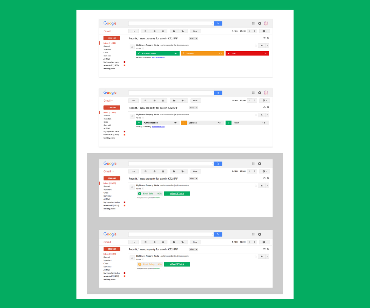
As well as the core app experience the product also has other touchpoints which include email. Once the user starts using the product they have access to email markers which give a snapshot view of the safety of their email. We went though several iterations of design for email to refine and simplify the way the key information was presented to the user.
Email Scan Results
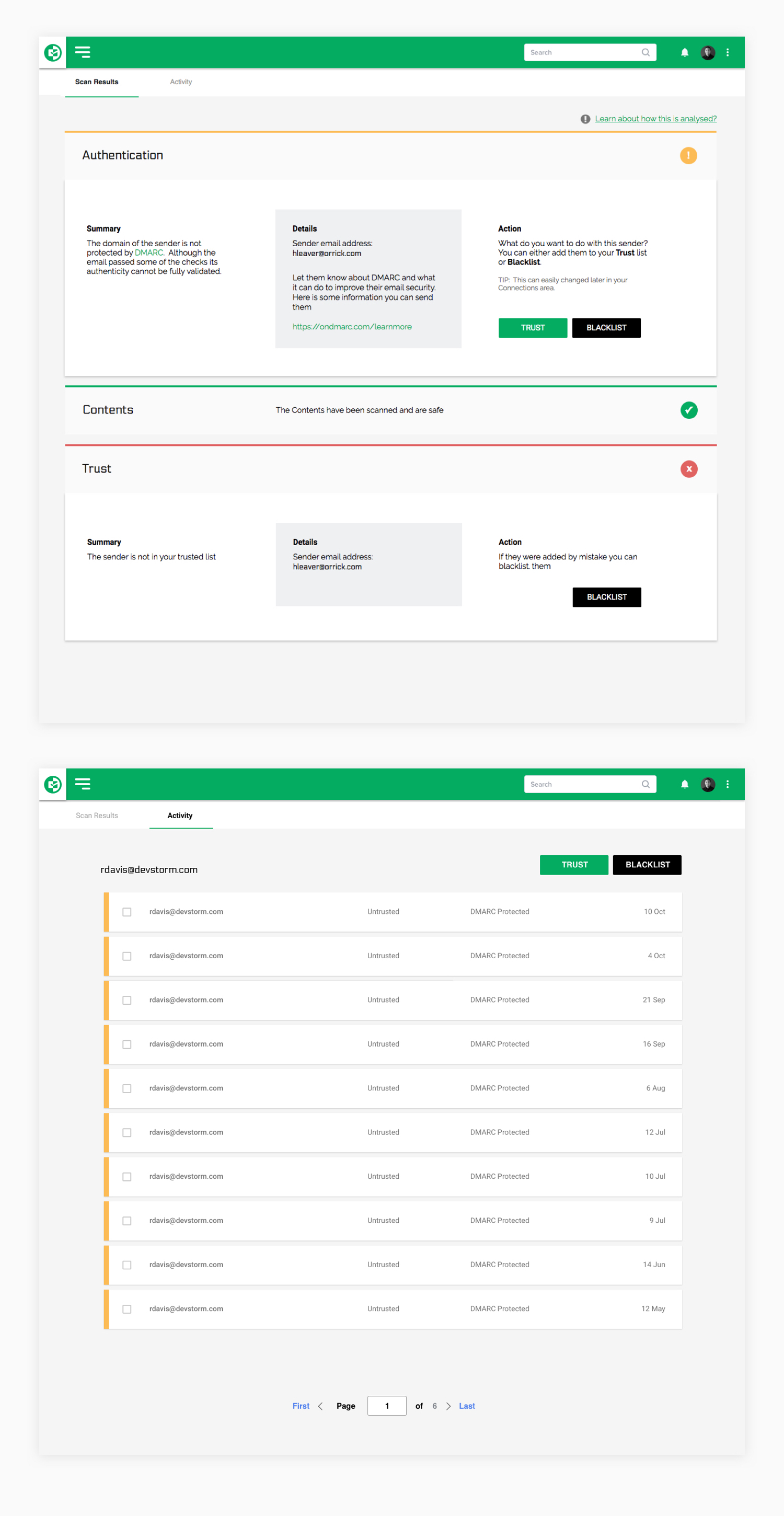
Accessible in the core app experience as well as through email markers, users are able to access scan results. The information presented to the user allows them to view a summary of the safety of a particular email but also the activity from that particular email address to help inform decision making on available actions.
Brand & Visual design
As part of the Red Sift product family we designed the logo so that it complimented them and fit in terms of form, colour and font.
Like the other products in the family we worked on creating a logo mark that could be used in isolation. The core Red Sift product OnDMARC logo utilises negative space in the logo mark. So the OnINBOX logo mark also uses negative space in the same style.
