Nandos - Redesign of Collection / Delivery ordering
I was commissioned to illustrate a piece for Vanguard’s cover story on how political accountability has affected our government's capacity to get things done. The writer posited that lobbyists were taking advantage of these checks and balances, making it more difficult for officials to draft and execute new reforms and public works.
Project Overview
Nando’s moved away from the existing supplier to create a new partnership with Deliveroo for all delivery fulfilment.
This partnership catalysed digital transformation in how Nando’s handled delivery/ collect online both on the web and mobile app.
The vision: To deliver a smooth enjoyable ordering experience that meets customer expectations in a rapidly changing landscape. Also bring inline the evolving Nando's brand.
The existing legacy technology that supported Nando’s collect & delivery services was in desperate need of a new infrastructure as the code base and experience developed by former delivery partners was inflexible and not up to the task for future aspirations in terms of performance or experience.
The project as a whole was concerned with re-developing the code base and systems as well as redesigning the online ordering customer journey to bring it inline with where competitors were already operating at, but also satisfy Nando’s future aspirations for expansion of digital products and services.
The scope included Finding a restaurant, adding to basket, checkout and order confirmation.
My role
My role at Nando’s was UI design working in tandem with a UX designer and in collaboration with UX research, business and the development team.
During my time at Nando’s I was involved in UI design for collection and delivery, Sign up / Login and membership management as well as order at table during the adaptations made for coping with servicing customers during the pandemic.
Challenges
The existing version of the app was limited in terms of function and utility. Beyond the core app screens, the critical user action related to ordering which redirected the user to the mobile optimised web view as a module hosted within the mobile app. One of the biggest pain points was that customers experienced ongoing issues with the signed in / members area of the app.
The Rewards members area of the existing app was a confusing customer experience which led to low scoring and unfavourable app reviews which typically made reference to the members experience directly as the main source of their frustration. For example, a contracted user flow, session management and authentication management and being able to view and manage your account easily were all areas that were problematic.
The biggest challenge was trying to focus on design delivery whilst also trying to establish new and more efficient ways of working and optimising our product delivery process. There is always a balance in a digital product delivery team environment which brings many challenges. The new team was continually working on achieving a better version of that whilst also evolving the brand and design system to better serve future design projects and product releases.
Our MVP from a technical perspective was a complex and lengthy process for the dev teams to create the new underlying architecture however from a design perspective the app was still basic and would not take the core experience of the app forward to delight customers.
Our task was helping Nando’s create an app that was capable of taking the design and experience beyond the scope of MVP.
Solution
Identifying the characteristics and experience for the entire family of Nando’s digital properties and how they function as a whole for its customers.
We focused on the existing app architecture and key user journeys as well as learnings from the UX research team to inform and map this to our product design.
The design team was split with UX and UI paired and working closely with the business and dev team. The UX team conducted workshops to establish existing journeys and architecture for registration, login and ordering.

Existing app user journeys (Conducted by UX / Research team)
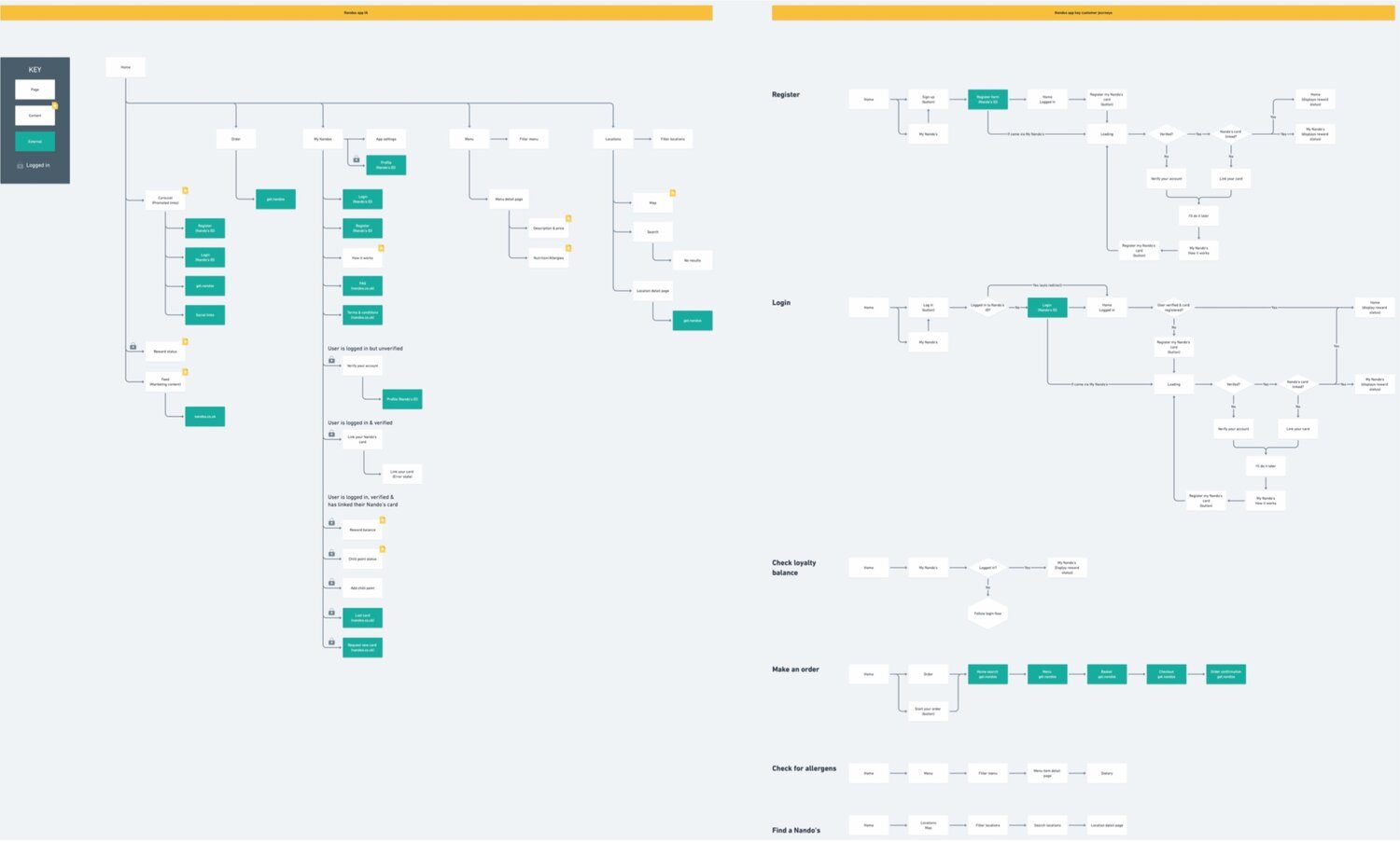
Nando’s app architecture (Conducted by UX / Research team)
Competitor analysis
Our user UX and research team conducted exploration work to identify key competitors and how they serviced customers in the same segment as Nando’s with special attention given to strengths and weaknesses in their app experience.
The competitor analysis was used to drive our design decisions through workshops and early prototypes used as proof of concept from a technical and customer perspective.
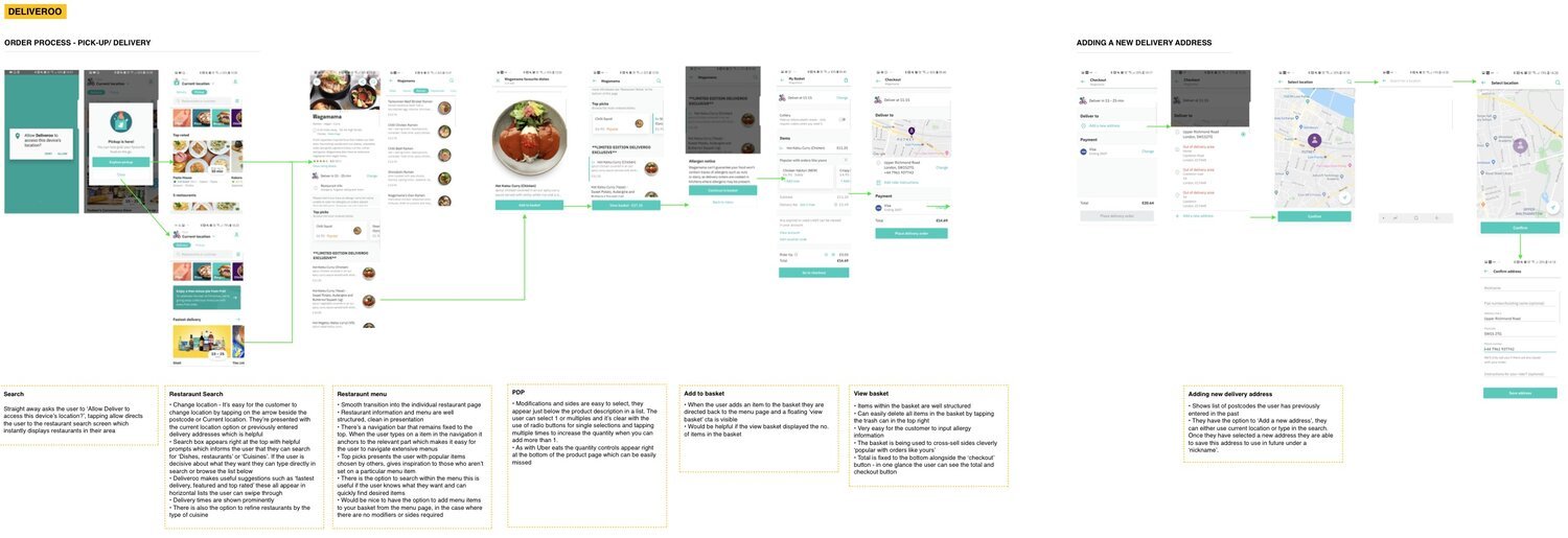
Screen captures from competitor analysis documentation (Conducted by UX / Research team)
UI / Visual Design
UI design was created with Sketch, InVision and Protopie for complex interactions where testing on odering journeys involving forms and validation was required.
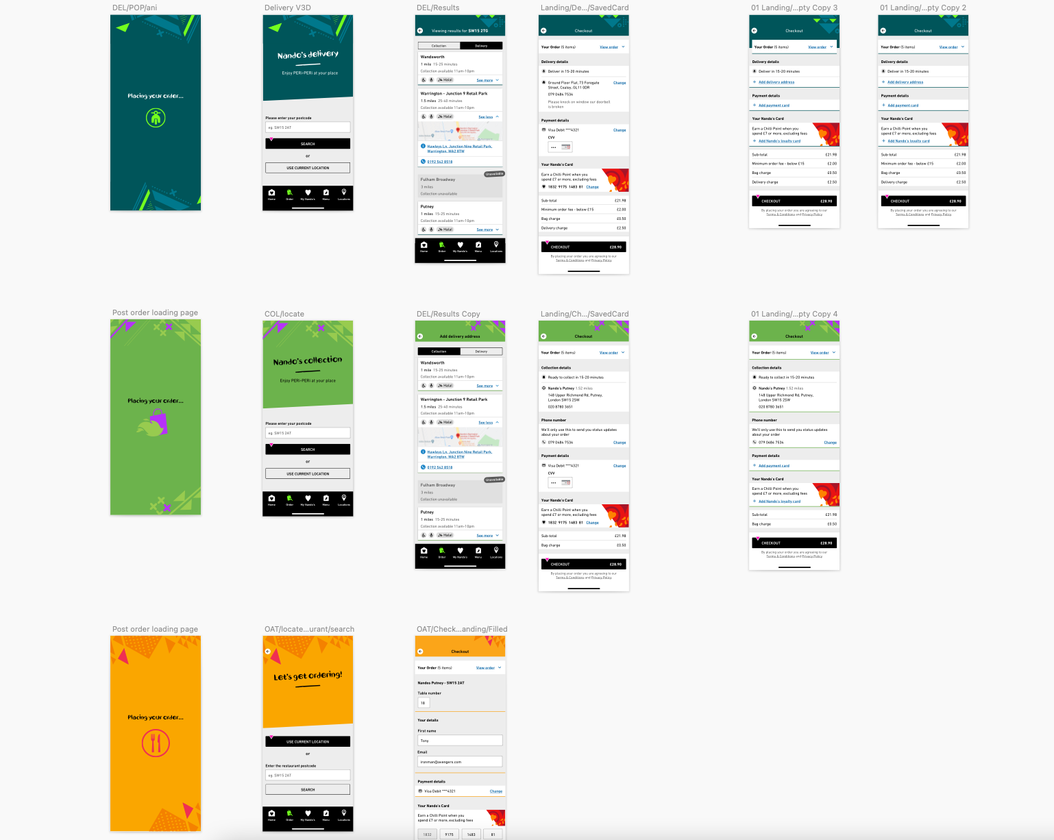
Nando’s Brand VI updates
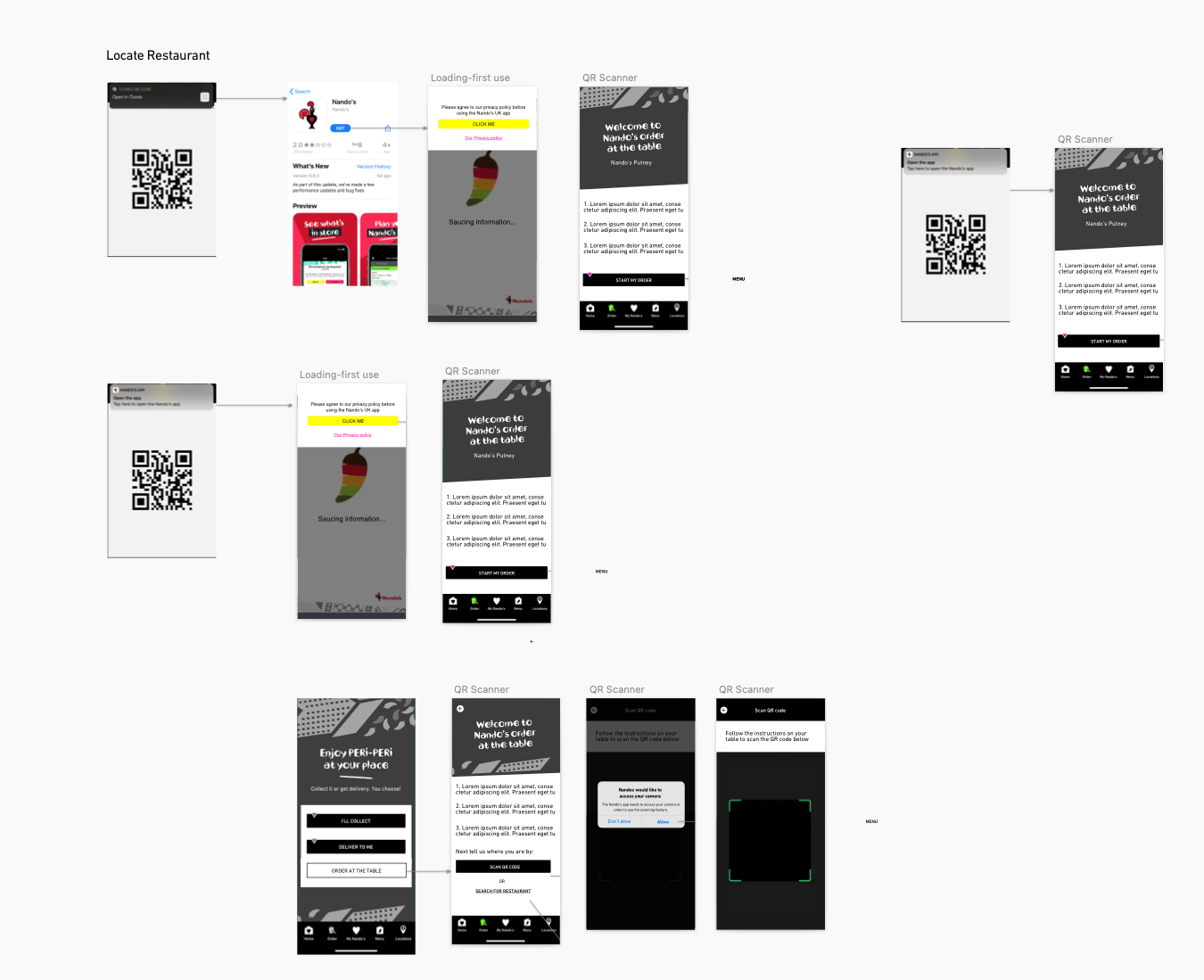
Locate restaurant flows
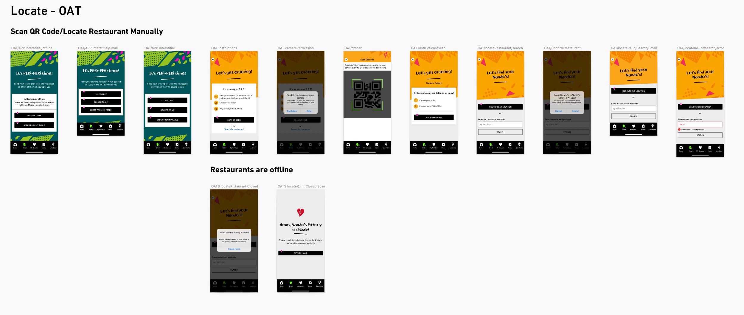
Locate restaurant UI design including Order At Table.
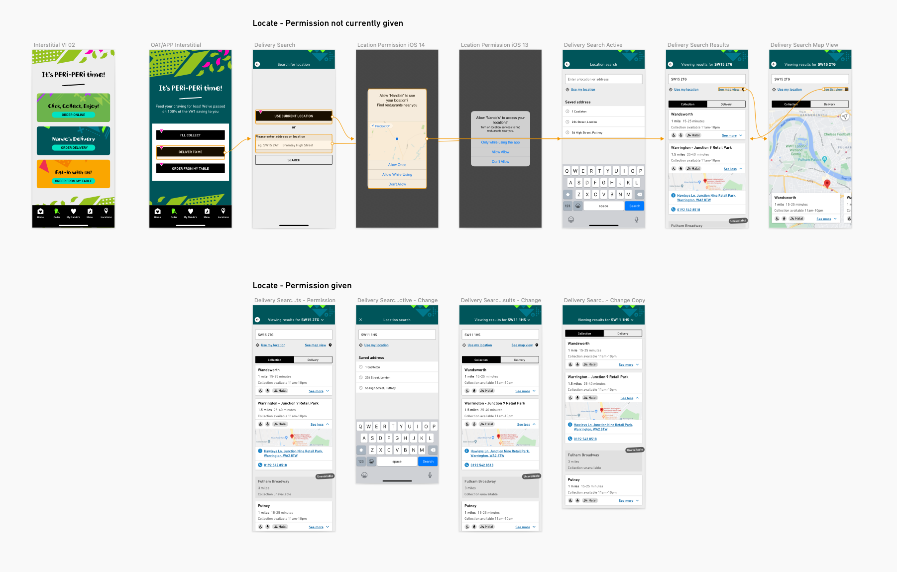
Locate restaurant - Location Permission
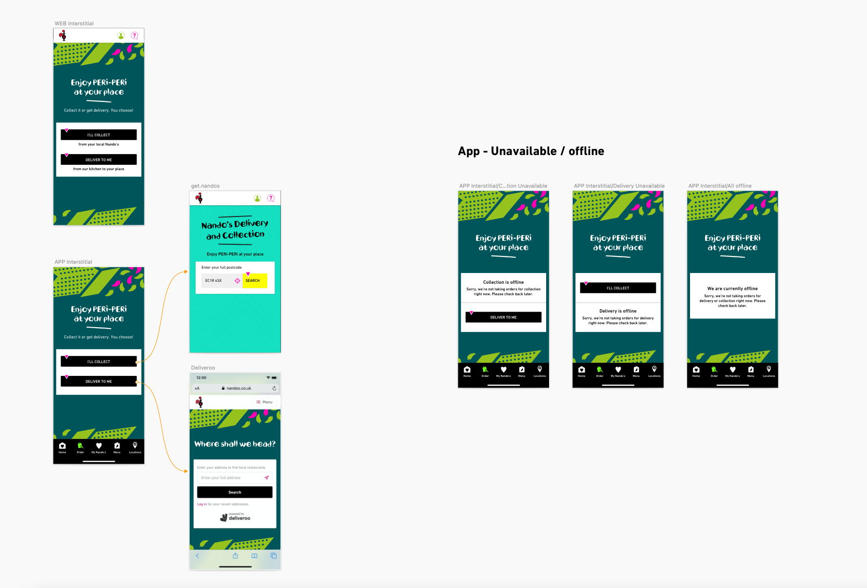
UI design for the interstitial screens for initial order flow
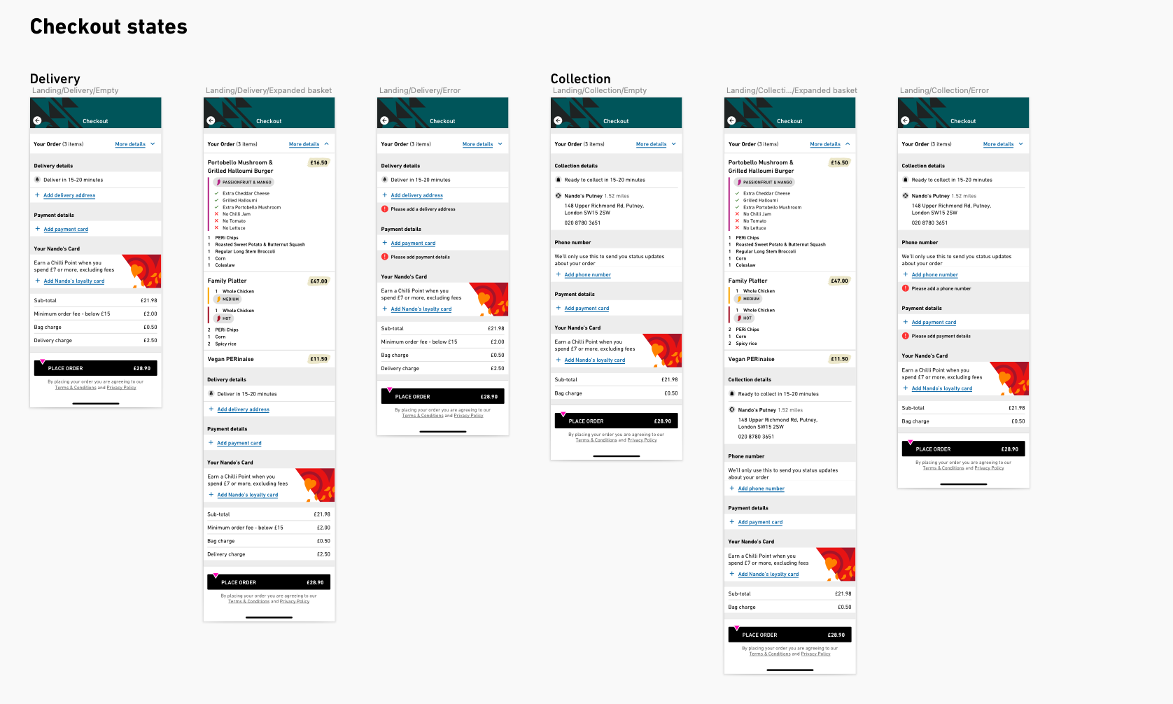
UI design - Checkout for Collection and Delivery

UI design - Checkout Add Delivery address
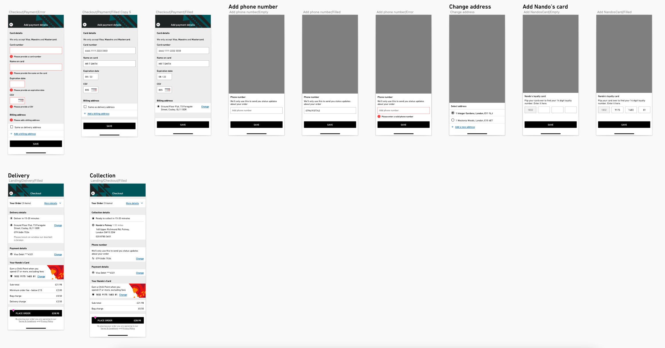
UI design - Checkout Add phone number, Nando’s Card
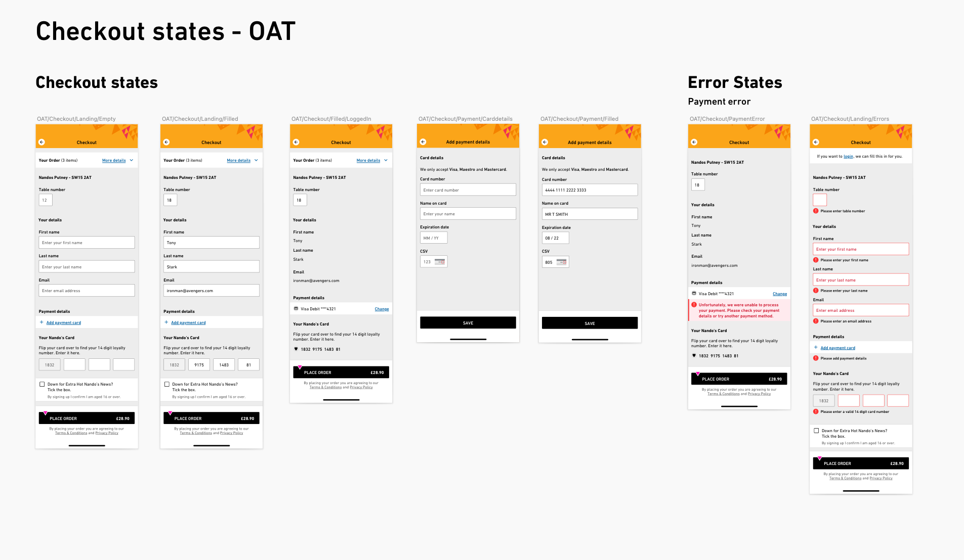
UI design - Checkout for Order At Table
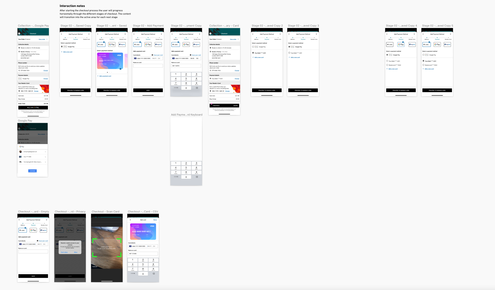
Future app design exploration iteration
Outcomes
We designed key journeys for the new native app experience for delivery & collection online ordering. We improved the end to end journey and received excellent feedback from our users in testing phases which helped validate and inform ongoing design for ordering.
Through ongoing design workshops we put in place the foundations for the beginnings of a Nando’s design system which would service web and mobile and in restaurant applications.
Due to the need to adapt to the impact of Covid 19 we rapidly designed and developed an ‘Order at table’ service so that customers could order food, pay in app and have food delivered to their table and help keep them and staff safe. Whilst this was a targeted order at table experience we created this so that the app design was flexible enough to be repurposed beyond that period.
Working collaboratively with delivery fulfillment partners we were able to deliver design that was true to Nando’s brand as well as seamlessly working within partner platforms.